
| 2012 London Olympic emblem unveiled | |
|---|---|
| Jun 5, 2007 20:25 |   |
 | The picture shows the Olympic emblem in 2012. It has four kinds of colours, pink, blue, green and orange. This logo will be te the emblems of Olympic Games and Paralympic Games. The emblem is formed up by four digits, 2, 0, 1, 2. The word London and the Olympic rings are embeded in the first two digits, 2 and 0. It symbolises the Olympic spirit and the ability of the Games to inspire people to take part - not just as spectators, but as volunteers, in the Cultural Olympiad and more. The new emblem will be used during the 10-week London 2012 Summer Roadshow, visiting different UK regions from June 15. It is said that 400,000 pounds is spent to design this logo. However, people hold negative attitudes toward it. How do you think of it? Personally, I think that it is modern and caters for the young people's taste. Creative and beautiful! 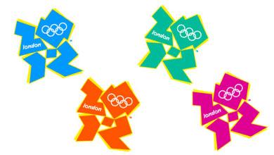 |

| Jun 5, 2007 20:44 | #1 |
| Nice!!!I like the blue one:-) |

| Jun 6, 2007 00:58 | #2 |
| Wow, so cute. They resemble the robots, aren't they? |

| Jun 6, 2007 19:57 | #3 |
| Ha ha, four robots dancing together. |

| Jun 9, 2007 14:51 | #4 |
| It will probably be removed now and replaced with different one. When they are on screen and flashing they cause people with epilepsy problems. |

| Jun 10, 2007 01:35 | #5 |
| Davec, is that true? I just found that people are not satisfied with this logo and think that it is not worth spending 400000 pounds to design it. It causes epilepsy problem. That is terrible. |
Post a Reply to: 2012 London Olympic emblem unveiled